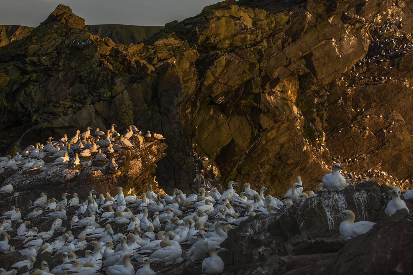
A gannet colony on sunlit sea cliffs at golden hour — the homepage hero photograph on the rebuilt Ewan Crosbie Photography site

The brief

Ewan's existing site was a Squarespace template holding a genuine body of award-winning work — internationally recognised images, sitting inside a design that didn't reflect the quality of the photography or the story behind it. The instruction this time was more open-ended than the expedition page's brief, and in some ways harder: build a site worthy of the work itself, with one explicit constraint — don't reuse anything from the expedition site's design system. This needed to be its own thing, not a re-skin.

That meant starting from zero on direction, palette, and typography, then building an actual content architecture underneath it — his photography, his writing, his upcoming expeditions — that could keep growing long after launch without needing us back in the codebase for every update.

The challenge

A few things made this a genuinely different project from the expedition landing page, not just a bigger version of it:

  • A photographer's site has to get out of the photography's way. We explored three creative directions before landing on one internally nicknamed "Long Exposure" — quiet, unhurried, closer to a nature-writing quarterly than a portfolio template. Near-black and warm paper tones, almost no saturated colour, so the photographs themselves supply it. The real discipline was restraint: every interactive idea we liked had to earn its place against the standing rule that the photography stays the hero.
  • Two countries, one story. Ewan's work spans British wildlife and a newer, growing body of work in Costa Rica. The easy version of this site would have split those into two separate galleries. We were told explicitly not to — it's one continuous practice with a turn in it, not two portfolios — which shaped how the whole site's information architecture came together.
  • Say what he does, early, plainly. Atmosphere is easy to overdo on a photography site. The brief was specific: state clearly that Ewan is a wildlife photographer, near the very top of the experience, before asking a visitor to sit with mood and pacing.
  • Building for a CMS that doesn't exist yet. There's no content-management system behind this site on day one — but there will be eventually. Every piece of content (photography captions, Field Notes dispatches, expedition listings) had to sit behind a typed content layer we control, not hard-coded into page templates, so that later swap doesn't mean a rebuild.

What we built

An original design system, built to spec

Near-black ink, warm paper cream, and a single cool accent colour — with a warm rust tone held in reserve, used only for the moment the story turns from the UK to Costa Rica. Typography is Bodoni Moda for headings (Ewan asked for "Bodoni" by name) paired with Montserrat for a secondary wordmark line — a typeface used nowhere else on the site, deliberately.

Two curated entry points into the full body of work

Rather than one long gallery grid, the homepage offers two considered edits — Awarded and Curated — each a pinned, scroll-driven filmstrip of images. Every photograph renders at its own true aspect ratio, portrait or landscape, with the dimensions read directly from the file itself. Swapping a photo is genuinely just replacing the file — nothing in the code needs to change to keep proportions correct.

A cinematic sequence for his expeditions

As Ewan's small-group photography trips grow beyond the first Costa Rica departure, the Experiences page needed to hold several offerings without turning into a busy comparison grid. Each one gets a pinned moment of the visitor's full attention as they scroll, cross-fading into the next rather than competing for space all at once.

Real dispatches, not blog filler

Field Notes is Ewan's own writing — short, first-person accounts from behind the camera, in his voice, not ours. The first entries are live and real, not placeholder copy, with more added as he writes them.

A content layer built to survive its first real CMS

Every page pulls from plain, human-editable files — structured data for galleries and expeditions, markdown for long-form writing — behind a typed layer the site's components never touch directly. When the day comes to plug in an actual CMS, that's a swap underneath the accessor layer, not a rewrite of the site.

Where design met real feedback

This build went through genuine client-directed revision, not just our own polish passes — worth naming because it's the difference between a site built at a client and one built with them:
  • The homepage originally carried a scroll-scrubbed colour-grade narrating the UK-to-Costa-Rica shift. Ewan felt it didn't belong on the homepage specifically — it now lives on the About page instead, where the story is actually being told.
  • The Selected Work concept was revised twice in a single day: from three galleries split by geography and species, down to two galleries split by curatorial intent instead — Awarded and Curated, with Curated deliberately mixing subjects and locations rather than reading as a themed collection.
  • Typography changed mid-build at Ewan's direct request, from an initially-shipped serif to Bodoni Moda — we kept the original version committed separately so nothing was lost in the switch.
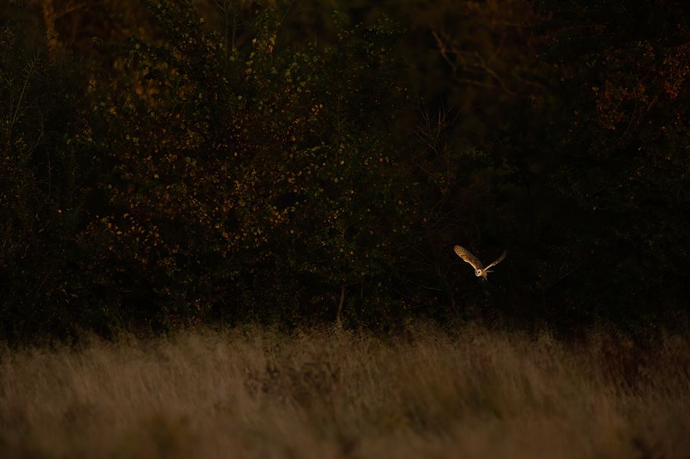
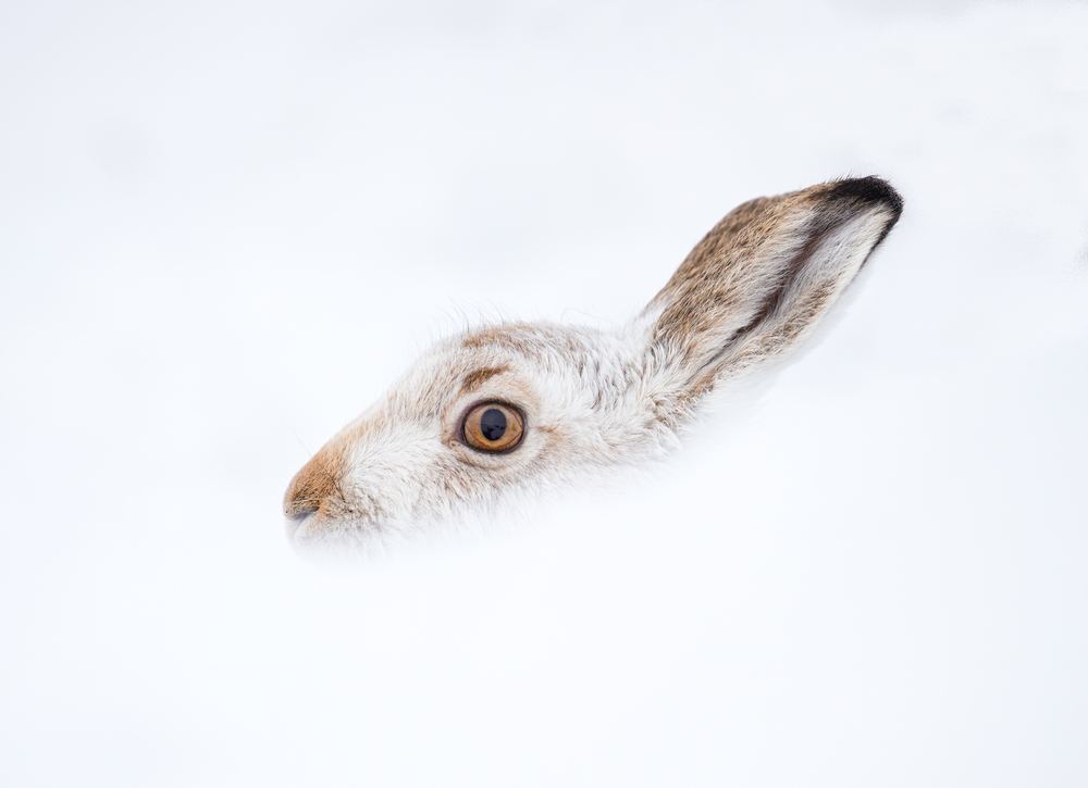
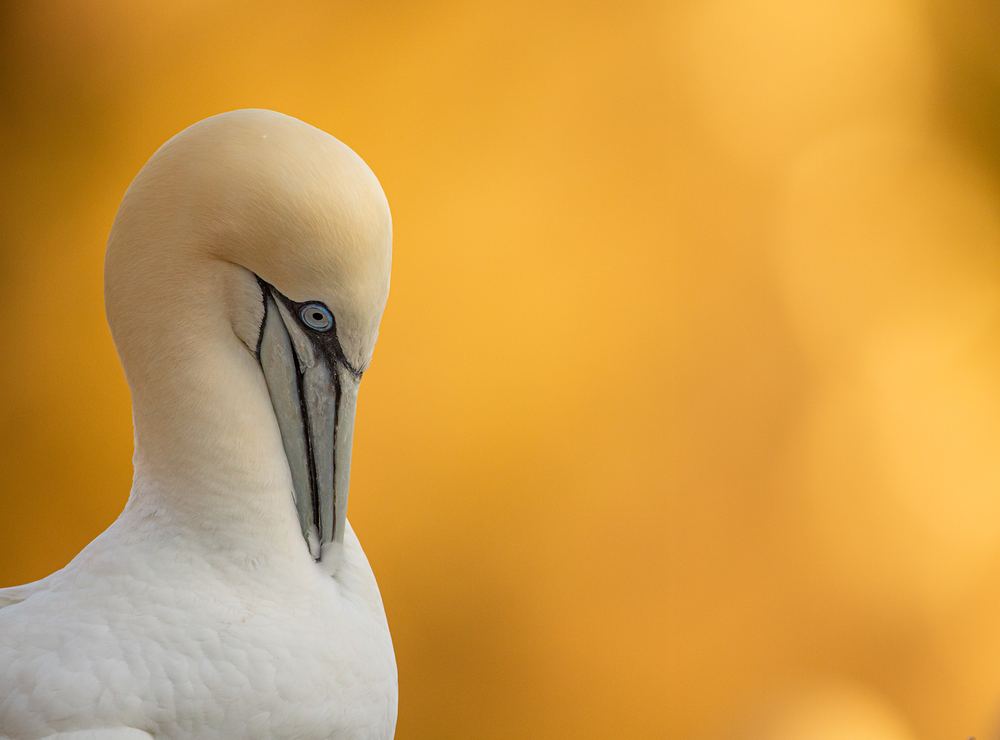
A mountain hare portrait in snow, wildlife photography by Ewan Crosbie A barn owl hunting at dusk over a field, wildlife photography by Ewan Crosbie A gannet portrait backlit by golden light, wildlife photography by Ewan Crosbie

Problem-solving along the way

A few real issues worth naming, because they're the kind that stay invisible right up until they aren't:

  • A font-loading bug that produced zero console errors: headings were silently rendering in the browser's fallback serif instead of the real typeface, because the custom properties supplying the font were declared on the wrong element for how they were being referenced elsewhere. Caught by checking computed styles directly, not by how the page looked at a glance.
  • A scroll-linked colour transition that computed perfectly under manual testing but never fired on a visitor's actual scrolling — the animation and its scroll trigger had been created as two separate objects instead of one paired call, a wiring mistake that doesn't announce itself because everything else about the effect looks like it's working.
  • A vertical "current section" label that occasionally froze on the wrong section name. Traced to how often the browser was allowed to recalculate it, not to the detection logic itself — an easy one to misdiagnose in the wrong direction first.

Where it stands

The site is live at ewancphotography.com, replacing the previous template site entirely. It launches with a real, previously-untapped photography library, real Field Notes entries in Ewan's own voice, and a structure built to keep growing as his expeditions and writing do. As with the expedition page, we'll add real results here once there's been time to gather them, rather than before we have them.

Designed for
An award-winning wildlife photographer replacing a template site with a real brand home
The goal
A site that reads as the actual body of work, with a foundation his expeditions and writing can keep growing into
What it demonstrates
Original design systems, scroll-driven interaction design, content architecture built to last
Custom design system Scroll-driven galleries True aspect-ratio images Real photo library curation CMS-ready content layer Next.js + GSAP

Want a site built with this much care about the details?

Real design thinking, real problem-solving, and a build you can actually keep updating yourself.